
R: Water Potability
Water Potability
In this post, I explore a dataset with observations of water sample properties and their corresponding drinkability. The dataset is from Aditya Kadiwal on Kaggle. In this analysis, I compare the performance of logistic, decision tree, and xgboost classification models by tracking each model’s ROC AUC metric. The xgboost model wins.
In this post, I use the R tidymodels framework. Tidymodels aims to unify models and modeling engines to streamline machine learning workflows under a consistent interface. It contains libraries for sampling, feature engineering, model creation, model fitting, model tuning, and result evaluation. Here, I use the following model and engine combinations:
| Model | Engine |
|---|---|
| Logistic | glm |
| Decision tree | rpart |
| Xgboost | xgboost |
Tidymodels allows me to handle these configurations in similar ways, which makes it easier to compare the results of the models.
Required libraries and random seed
Required libraries
library(readr)
library(dplyr)
library(tidyr)
library(ggplot2)
library(rsample)
library(parsnip)
library(yardstick)
library(ggplot2)
library(tune)
library(recipes)
library(workflows)
library(dials)
library(xgboost)
Random seed
set.seed(123)Initial data load
The dataset contains 3276 rows of data, which I split into 2457 rows for training and 819 rows for testing. All observations have one categorical classification variable and nine numeric predictor variables.
According to the Kaggle post, the variable meanings are:
| Variable | Meaning |
|---|---|
| pH | pH of water (0 to 14). |
| Hardness | Capacity of water to precipitate soap in mg/L. |
| Solids | Total dissolved solids in ppm. |
| Chloramines | Amount of Chloramines in ppm. |
| Sulfate | Amount of Sulfates dissolved in mg/L. |
| Conductivity | Electrical conductivity of water in μS/cm. |
| Organic_carbon | Amount of organic carbon in ppm. |
| Trihalomethanes | Amount of Trihalomethanes in μg/L. |
| Turbidity | Measure of light emitting property of water in NTU. |
| Potability | Indicates if water is safe for human consumption. Potable=1 and Not potable=0 |
water <- read_csv("data/water_potability.csv")
knitr::kable(head(water))| ph | Hardness | Solids | Chloramines | Sulfate | Conductivity | Organic_carbon | Trihalomethanes | Turbidity | Potability |
|---|---|---|---|---|---|---|---|---|---|
| NA | 204.8905 | 20791.32 | 7.300212 | 368.5164 | 564.3087 | 10.379783 | 86.99097 | 2.963135 | 0 |
| 3.716080 | 129.4229 | 18630.06 | 6.635246 | NA | 592.8854 | 15.180013 | 56.32908 | 4.500656 | 0 |
| 8.099124 | 224.2363 | 19909.54 | 9.275884 | NA | 418.6062 | 16.868637 | 66.42009 | 3.055934 | 0 |
| 8.316766 | 214.3734 | 22018.42 | 8.059332 | 356.8861 | 363.2665 | 18.436525 | 100.34167 | 4.628770 | 0 |
| 9.092223 | 181.1015 | 17978.99 | 6.546600 | 310.1357 | 398.4108 | 11.558279 | 31.99799 | 4.075075 | 0 |
| 5.584087 | 188.3133 | 28748.69 | 7.544869 | 326.6784 | 280.4679 | 8.399735 | 54.91786 | 2.559708 | 0 |
Feature engineering
For this analysis, I made two changes to the dataset.
Visualizing number of missing values.
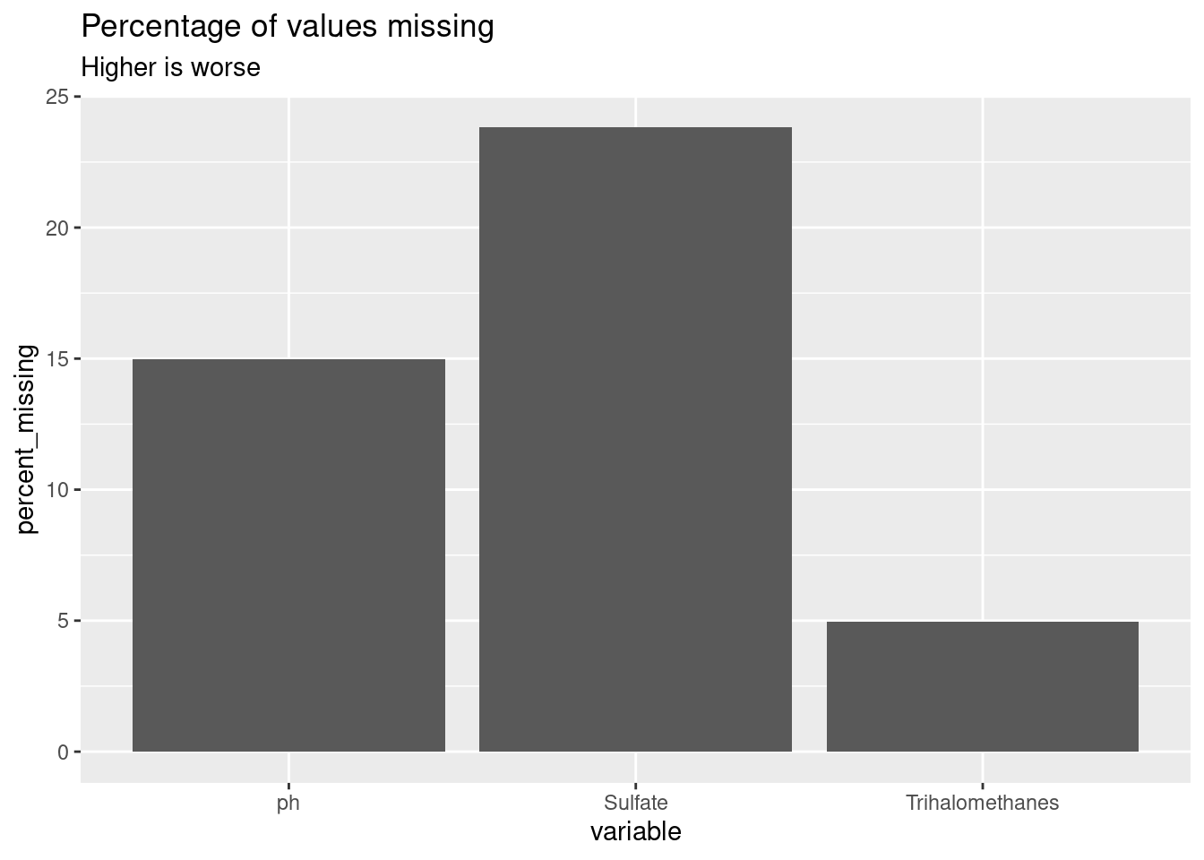
First, I had to fill in many missing values. I modified the approach in the article Missing Value Visualization to create a visualization of the percent of missing values for three dataset columns.
water_total_rows = nrow(water)

water_missing <- water %>%
  pivot_longer(everything(), names_to = "name", values_to = "value") %>%
  mutate(is_missing = is.na(value)) %>%
  group_by(name, is_missing) %>%
  summarize(num_missing = n()) %>%
  filter(is_missing) %>%
  transmute(
    percent_missing = num_missing / water_total_rows * 100
  ) %>%
  rename(variable = name) %>%
  arrange(desc(percent_missing))

knitr::kable(water_missing)| variable | percent_missing |
|---|---|
| Sulfate | 23.840049 |
| ph | 14.987790 |
| Trihalomethanes | 4.945055 |
ggplot(water_missing, aes(x = variable, y = percent_missing)) +
  geom_col() +
  labs(
    title = "Percentage of values missing",
    subtitle = "Higher is worse"
  )
Transform Potability into a factor
Second, I changed the potability column into a factor with two levels of potable and not_potable. I am training the models to predict when a water sample is drinkable, so the first level is the event of interest.
water_2 <- water %>%
  mutate(potable = factor(
      case_when(
        Potability == 0 ~ "not_potable",
        Potability == 1 ~ "potable"
      ),
      levels = c("potable", "not_potable")
    )
  ) %>%
  select(-Potability)

knitr::kable(head(water_2))| ph | Hardness | Solids | Chloramines | Sulfate | Conductivity | Organic_carbon | Trihalomethanes | Turbidity | potable |
|---|---|---|---|---|---|---|---|---|---|
| NA | 204.8905 | 20791.32 | 7.300212 | 368.5164 | 564.3087 | 10.379783 | 86.99097 | 2.963135 | not_potable |
| 3.716080 | 129.4229 | 18630.06 | 6.635246 | NA | 592.8854 | 15.180013 | 56.32908 | 4.500656 | not_potable |
| 8.099124 | 224.2363 | 19909.54 | 9.275884 | NA | 418.6062 | 16.868637 | 66.42009 | 3.055934 | not_potable |
| 8.316766 | 214.3734 | 22018.42 | 8.059332 | 356.8861 | 363.2665 | 18.436525 | 100.34167 | 4.628770 | not_potable |
| 9.092223 | 181.1015 | 17978.99 | 6.546600 | 310.1357 | 398.4108 | 11.558279 | 31.99799 | 4.075075 | not_potable |
| 5.584087 | 188.3133 | 28748.69 | 7.544869 | 326.6784 | 280.4679 | 8.399735 | 54.91786 | 2.559708 | not_potable |
Train/test split
I split the data into 75% for training and 25% for testing. I use the same train/test split across all models in this comparison.
water_split <- initial_split(water_2, prop = 0.75, strata = potable)
water_train <- training(water_split)
Filling missing values with k nearest neighbors (kNN)
I use kNN imputation to fill the missing values in the data.
clean_water_recipe <- recipe(potable ~ ., data = water_train) %>%
  step_impute_knn(all_numeric(), neighbors = 10)
Exploratory visualization
First, get a copy of the all data with the missing values filled in to use in the visualizations.
clean_water <- clean_water_recipe %>%
  prep(training = water_train) %>%
  bake(new_data = water_2)
How many observations are in class?
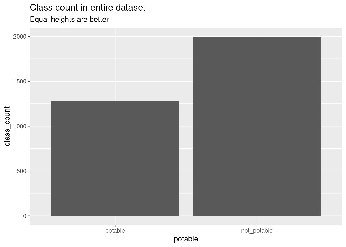
More of the observations are of non-potable water samples. I suspect this made it harder to train the models on examples of potable water.
clean_water_class_count <- clean_water %>%
  group_by(potable) %>%
  summarize(class_count = n())

knitr::kable(clean_water_class_count)| potable | class_count |
|---|---|
| potable | 1278 |
| not_potable | 1998 |
ggplot(clean_water_class_count, aes(x = potable, y = class_count)) +
  geom_col() +
  labs(
      title = "Class count in entire dataset",
      subtitle = "Equal heights are better"
    )
Distributions variables depending on potability
After filling the missing values with kNN, I made violin plots lining up distributions for each variable depending on whether they were from potable samples.
ggplot(clean_water, aes(x = potable, y = ph)) +
  geom_violin() +
  ggtitle("pH")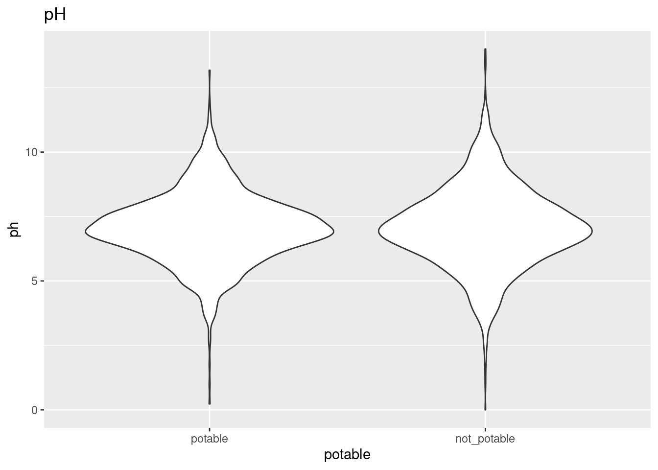
ggplot(clean_water, aes(x = potable, y = Hardness)) +
  geom_violin() +
  ggtitle("Hardness")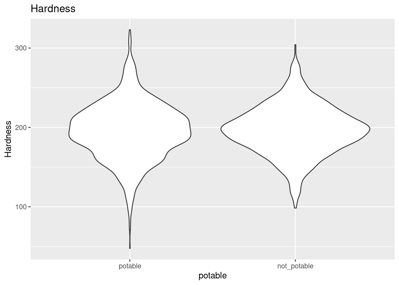
ggplot(clean_water, aes(x = potable, y = Solids)) +
  geom_violin() +
  ggtitle("Solids")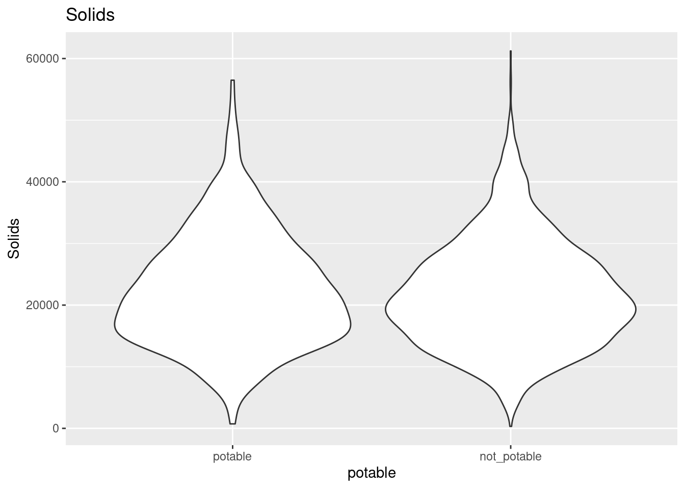
ggplot(clean_water, aes(x = potable, y = Chloramines)) +
  geom_violin() +
  ggtitle("Chloramines")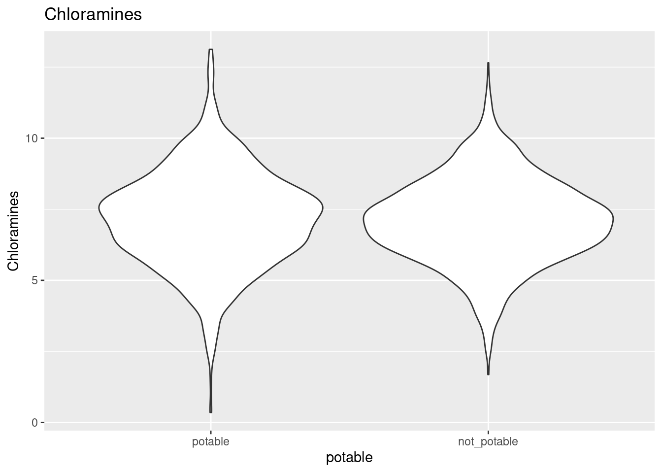
ggplot(clean_water, aes(x = potable, y = Sulfate)) +
  geom_violin() +
  ggtitle("Sulfate")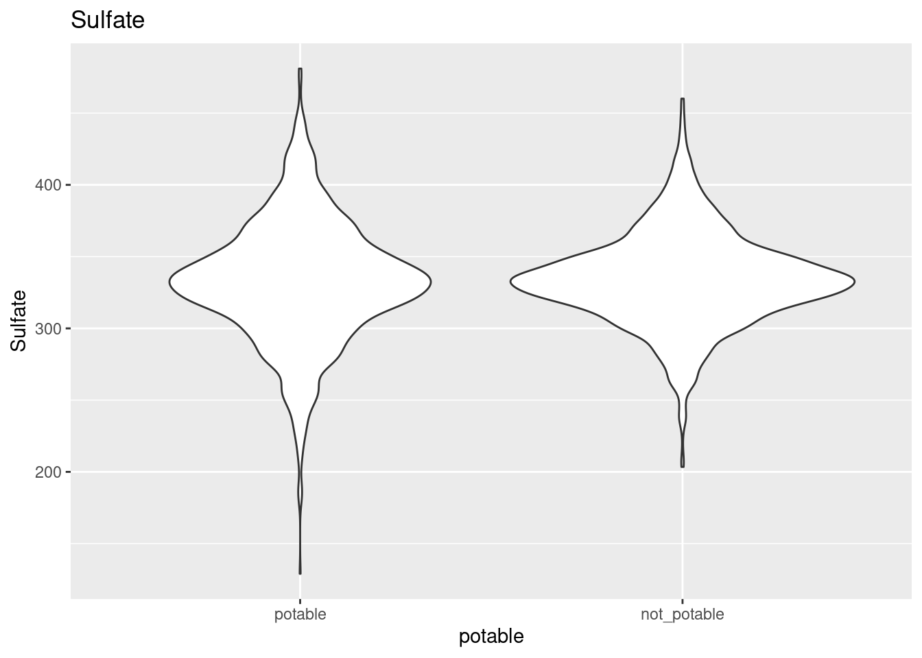
ggplot(clean_water, aes(x = potable, y = Conductivity)) +
  geom_violin() +
  ggtitle("Conductivity")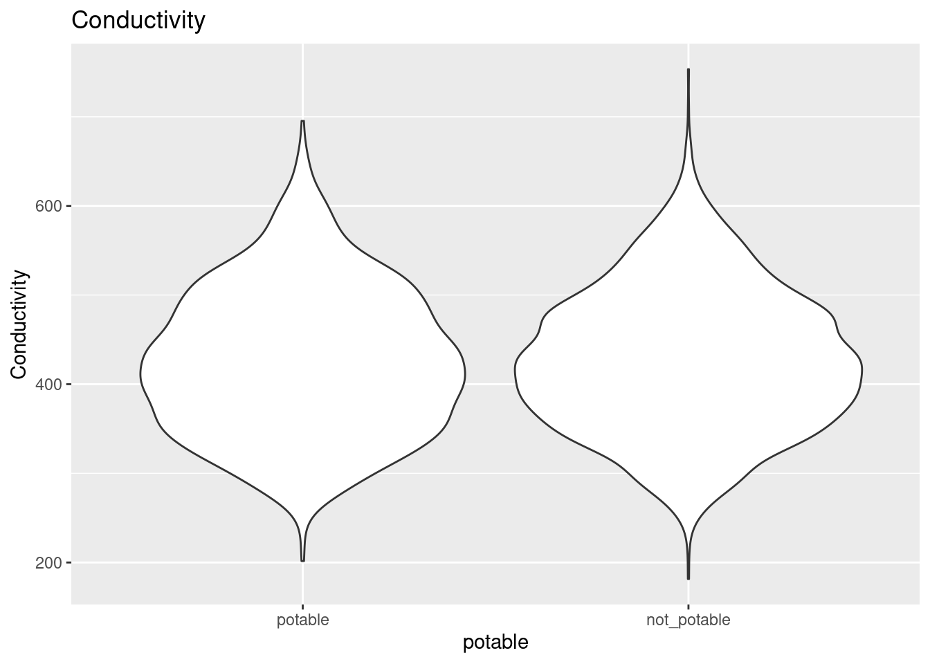
ggplot(clean_water, aes(x = potable, y = Organic_carbon)) +
  geom_violin() +
  ggtitle("Organic Carbon")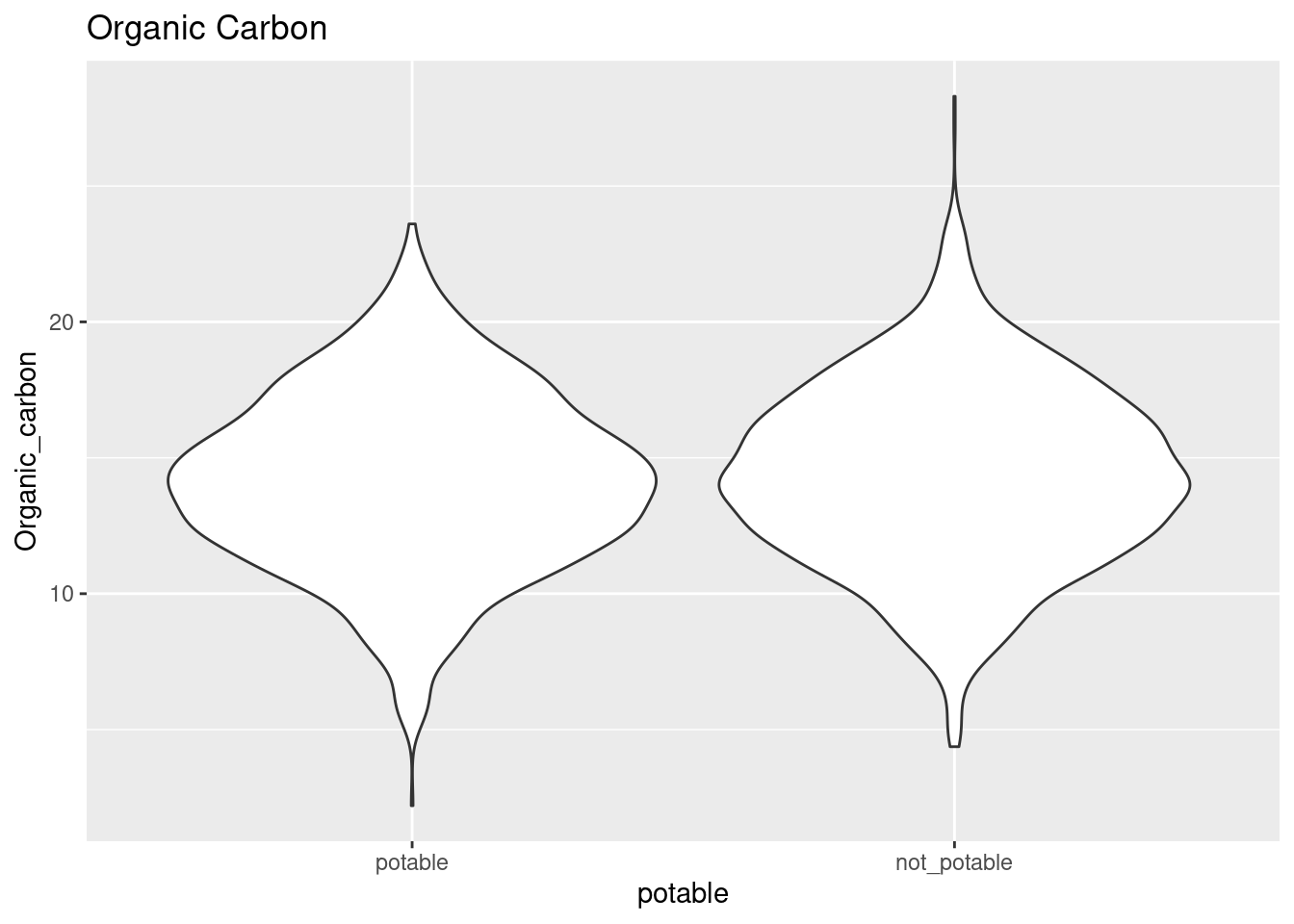
ggplot(clean_water, aes(x = potable, y = Trihalomethanes)) +
  geom_violin() +
  ggtitle("Trihalomethanes")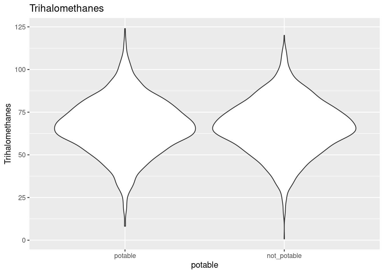
ggplot(clean_water, aes(x = potable, y = Turbidity)) +
  geom_violin() +
  ggtitle("Turbidity")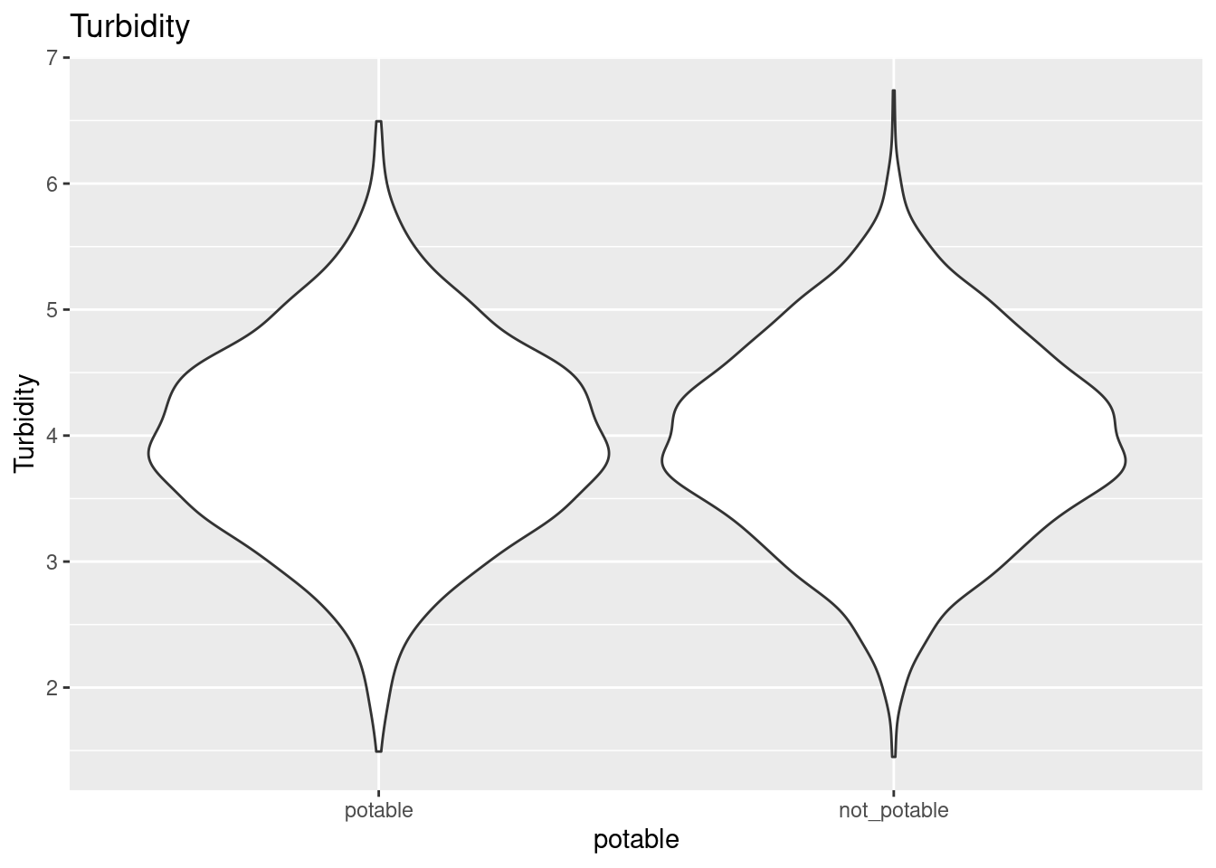
Cross validation and evaluation metrics
I use the same k-fold cross validation and evaluation metrics for all models in this post.
k-fold cross validation
I use 20 folds stratified by the potable outcome variable for cross-validation.
water_folds <- vfold_cv(water_train, v = 20, strata = potable)Evaluation metrics
I gather ROC AUC, sensitivity, and specificity metrics for each fold and hyperparameter combination during training.
common_metric_set <- metric_set(roc_auc, sens, spec)Logistic classifier
I fit a logistic classifier first to establish a baseline of performance that the other models should exceed. There are no hyperparameters to configure on the logistic model, so I don’t have a tuning step.
Create and fit the logistic model
logistic_model <- logistic_reg() %>%
  set_engine("glm") %>%
  set_mode("classification")

logistic_last_fit <- logistic_model %>%
  last_fit(potable ~ ., split = water_split)
Evaluate logistic performance
The ROC AUC curve lines up mainly along the diagonal for the logistic classifier, so the classification performance is about the same as a coin toss. That’s pretty bad and won’t be hard to exceed using the other models.
logistic_last_fit_metrics <- logistic_last_fit %>%
  collect_metrics()

logistic_last_fit_roc_auc <- logistic_last_fit_metrics %>%
  filter(.metric == "roc_auc") %>%
  pull(.estimate)

knitr::kable(logistic_last_fit_metrics)| .metric | .estimator | .estimate | .config |
|---|---|---|---|
| accuracy | binary | 0.6177606 | Preprocessor1_Model1 |
| roc_auc | binary | 0.4844861 | Preprocessor1_Model1 |
logistic_last_fit_results <- logistic_last_fit %>%
  collect_predictions()

logistic_last_fit_results %>%
  roc_curve(truth = potable, .pred_potable) %>%
  autoplot()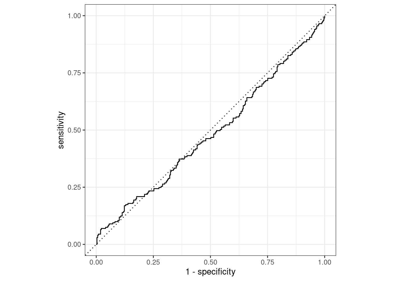
Decision tree classifier
The second classifier I trained was a decision tree. Here, there were cost_complexity, tree_depth, and min_n hyperparameters to tune. I use k-fold cross validation and a simple grid search to tune these hyperparameters.
Decision tree workflow and grid
decision_tree_model <- decision_tree(
    cost_complexity = tune(),
    tree_depth = tune(),
    min_n = tune()
  ) %>%
  set_engine("rpart") %>%
  set_mode("classification")

decision_tree_workflow <- workflow() %>%
  add_model(decision_tree_model) %>%
  add_recipe(clean_water_recipe)

decision_tree_grid <- grid_random(parameters(decision_tree_model), size = 10)
Tune the decision tree
doParallel::registerDoParallel()

decision_tree_tuning <- decision_tree_workflow %>%
  tune_grid(
    resamples = water_folds,
    grid = decision_tree_grid,
    metrics = common_metric_set
  )
Fit the best decision tree
I select the top-performing decision tree based on the ROC AUC metric.
best_decision_tree_model <- decision_tree_tuning %>%
  select_best(metric = "roc_auc")

final_decision_tree_workflow <- decision_tree_workflow %>%
  finalize_workflow(best_decision_tree_model)

decision_tree_final_fit <- final_decision_tree_workflow %>%
  last_fit(split = water_split)
Evaluate decision tree performance
The decision tree’s ROC AUC is 0.62, which, while better than the logistic classifier, is still not very good.
decision_tree_final_fit_metrics <- decision_tree_final_fit %>%
  collect_metrics()

decision_tree_final_fit_roc_auc <- decision_tree_final_fit_metrics %>%
  filter(.metric == "roc_auc") %>%
  pull(.estimate)

knitr::kable(decision_tree_final_fit_metrics)| .metric | .estimator | .estimate | .config |
|---|---|---|---|
| accuracy | binary | 0.6231707 | Preprocessor1_Model1 |
| roc_auc | binary | 0.6220531 | Preprocessor1_Model1 |
decision_tree_final_fit %>%
  collect_predictions() %>%
  roc_curve(truth = potable, .pred_potable) %>%
  autoplot()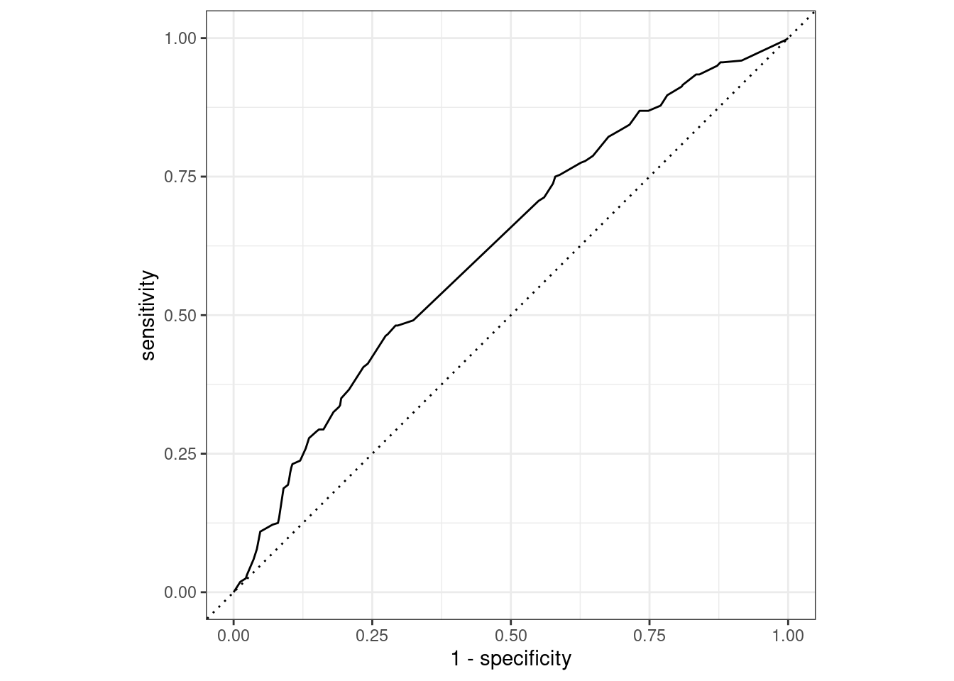
xgboost
The third classifier I trained was an xgboost model. Here, there were the trees, min_n, tree_depth, learn_rate, loss_reduction, and sample_size hyperparameters to tune. I tune these hyperparameters with a random grid search.
Define the model and the workflow to go with it.
xgboost_model <-
  boost_tree(
    trees = tune(),
    min_n = tune(),
    tree_depth = tune(),
    learn_rate = tune(),
    loss_reduction = tune(),
    sample_size = tune()
  ) %>%
  set_mode("classification") %>%
  set_engine("xgboost")

xgboost_workflow <-
  workflow() %>%
  add_recipe(clean_water_recipe) %>%
  add_model(xgboost_model)

xgboost_grid <- grid_random(parameters(xgboost_model), size = 10)
Tune the xgboost
doParallel::registerDoParallel()

xgboost_tuning <- xgboost_workflow %>%
  tune_grid(
    resamples = water_folds,
    grid = xgboost_grid,
    metrics = common_metric_set
  )
Finalize the best xgboost
best_xgboost_model <- xgboost_tuning %>%
  select_best(metric = "roc_auc")

final_xgboost_workflow <- xgboost_workflow %>%
  finalize_workflow(best_xgboost_model)

xgboost_final_fit <- final_xgboost_workflow %>%
  last_fit(split = water_split)
Evaluate xgboost performance
With a ROC AUC of 0.65, the xgboost outperforms the decision tree, but not by much.
xgboost_final_fit_metrics <- xgboost_final_fit %>%
  collect_metrics()

xgboost_final_fit_roc_auc <- xgboost_final_fit_metrics %>%
  filter(.metric == "roc_auc") %>%
  pull(.estimate)

knitr::kable(xgboost_final_fit_metrics)| .metric | .estimator | .estimate | .config |
|---|---|---|---|
| accuracy | binary | 0.6500000 | Preprocessor1_Model1 |
| roc_auc | binary | 0.6547125 | Preprocessor1_Model1 |
xgboost_final_fit %>%
  collect_predictions() %>%
  roc_curve(truth = potable, .pred_potable) %>%
  autoplot()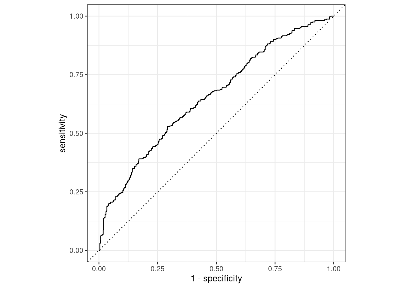
Final comparison
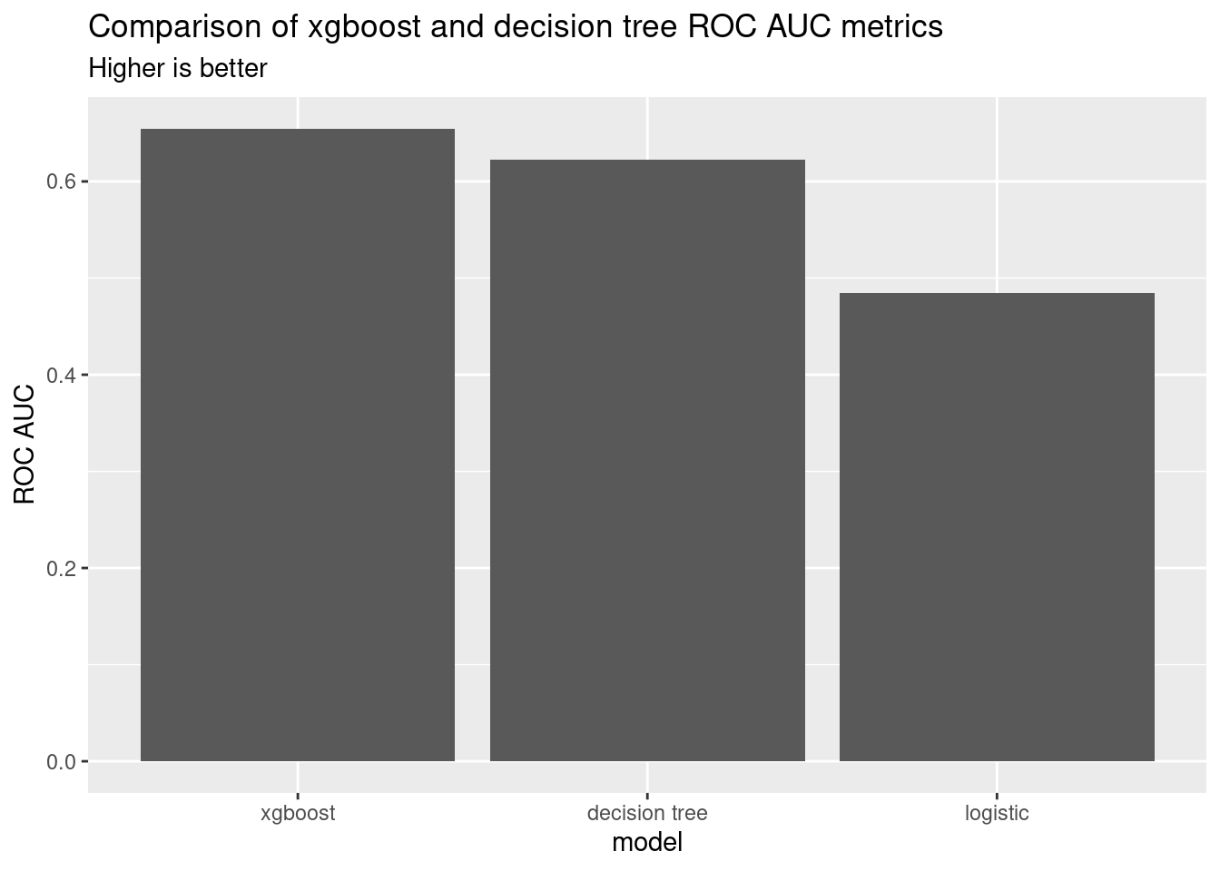
I plotted the ROC AUC metrics for the final comparison for all three models. The xgboost model is the best, followed by the decision tree and logistic models.
comparison <- tibble(
    model = factor(
      c("xgboost", "decision tree", "logistic"),
      levels = c("xgboost", "decision tree", "logistic")
    ),
    roc_auc = c(
      xgboost_final_fit_roc_auc,
      decision_tree_final_fit_roc_auc,
      logistic_last_fit_roc_auc
    )
  ) %>%
  arrange(desc(roc_auc))

knitr::kable(comparison)| model | roc_auc |
|---|---|
| xgboost | 0.6547125 |
| decision tree | 0.6220531 |
| logistic | 0.4844861 |
ggplot(comparison, aes(x = model, y = roc_auc)) +
  geom_col() +
  labs(
    y = "ROC AUC",
    title = "Comparison of xgboost and decision tree ROC AUC metrics",
    subtitle = "Higher is better"
  )
Conclusion and next steps
My feature engineering only included kNN missing value imputation. If I were to revisit this analysis, I would explore other feature engineering options to improve the quality of the input data.
